The main purpose of the Concept was to emulate the liveliness of Spanish bars. The project definitely started from a genuine passion: Spanish food. In their survey, they recognized that part of the success of these bars was their liveliness and informality.

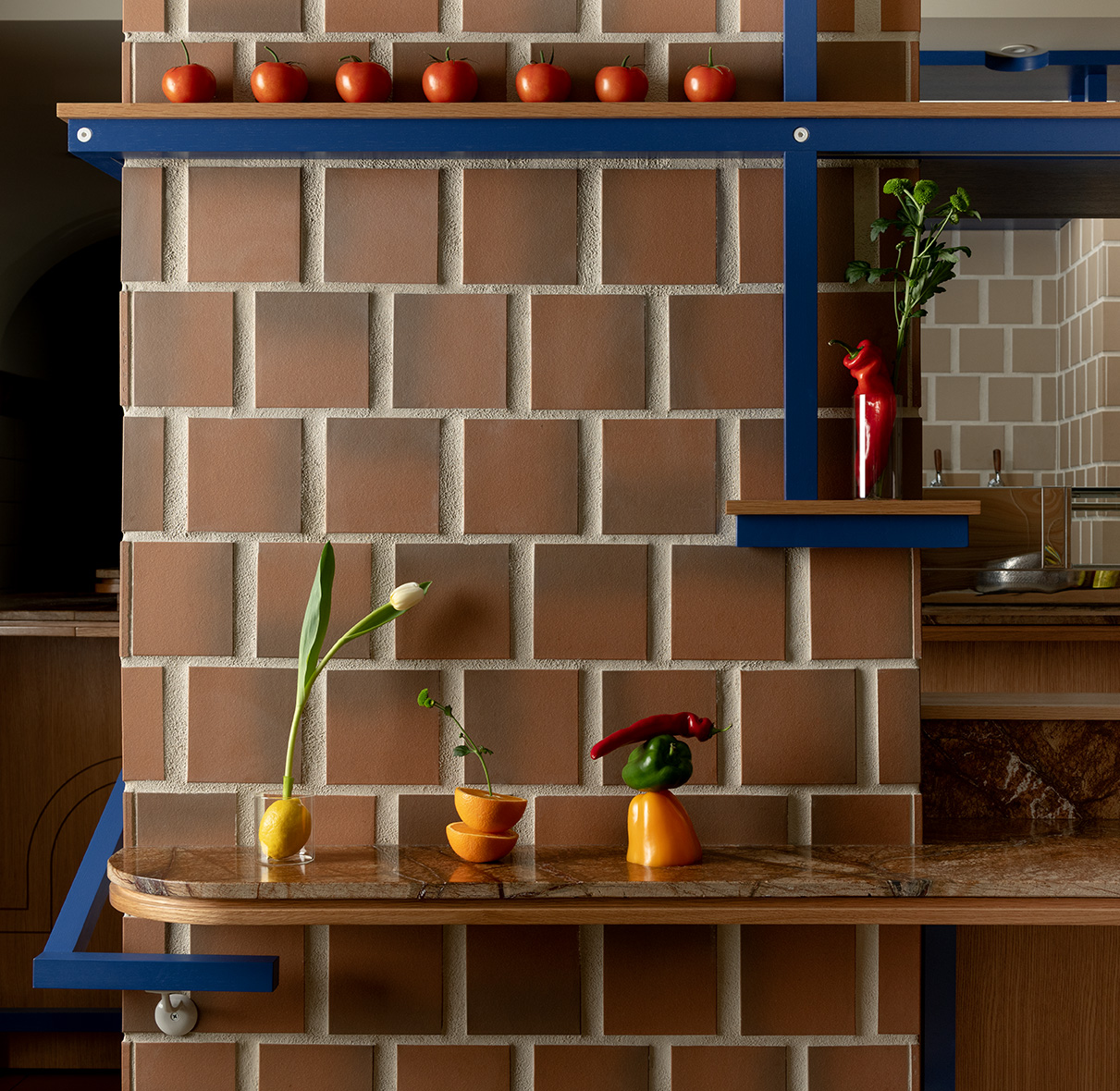
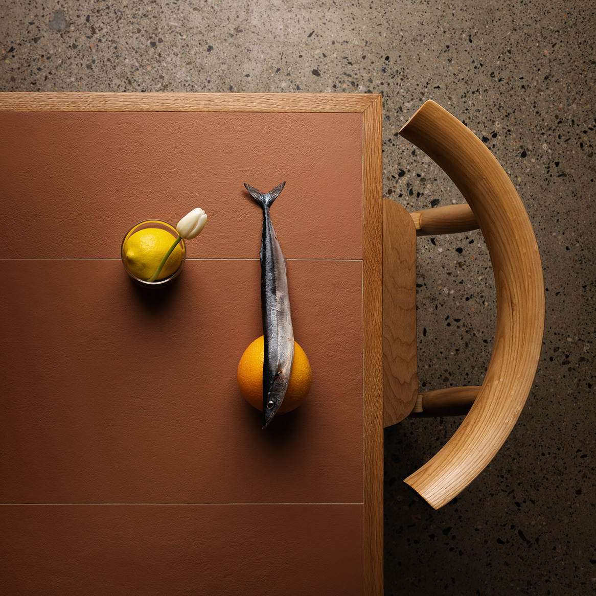
Surrealism and colour for a Tapas bar. Ceramic, stonework and wooden design the space
The Stemarie Art Design Studio creates a design-oriented tapas. The graphics and colours of Spanish culture influenced the preliminary design, which is reflected in the choice of colours and the use of materials: ceramic, wood and stone are modulated geometrically defining the spaces.

Their aim was to provide an informal place where customers could relax and enjoy themselves. During the designing of this space, they were intrigued about how tapas evolved in Spanish culture. It is said that bartenders served beer with a saucer on it to avoid flies, realizing that they could use it to serve a small snack, thus attracting new customers. In creating the history of this not very informal space, the concept has been exemplified in the use of colour and particularly blue inspired by Jean Miro.

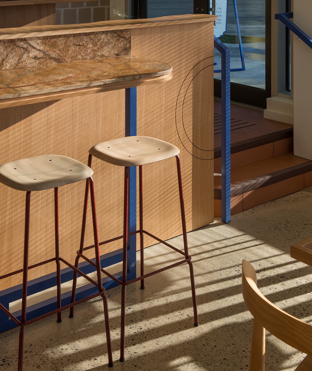
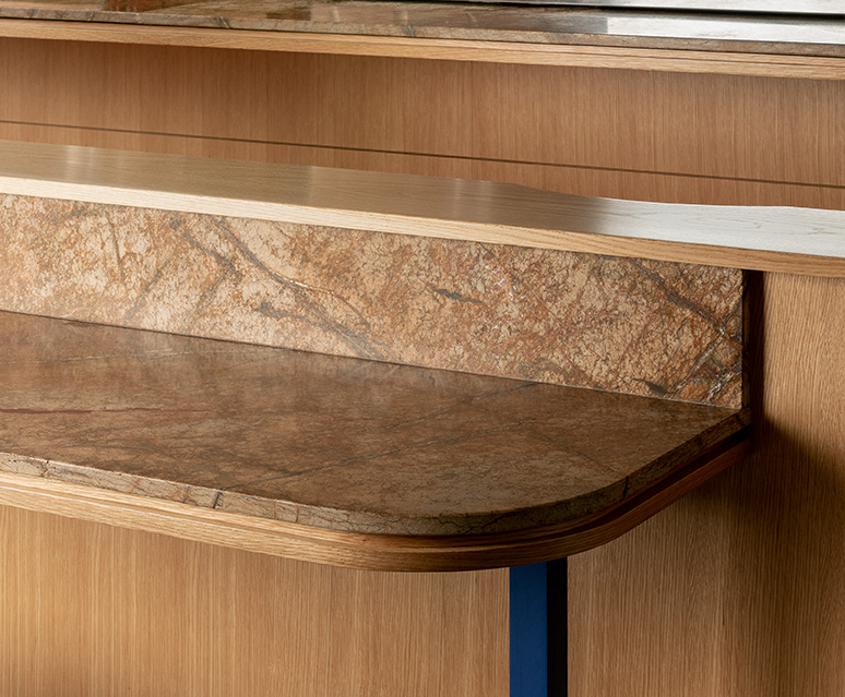
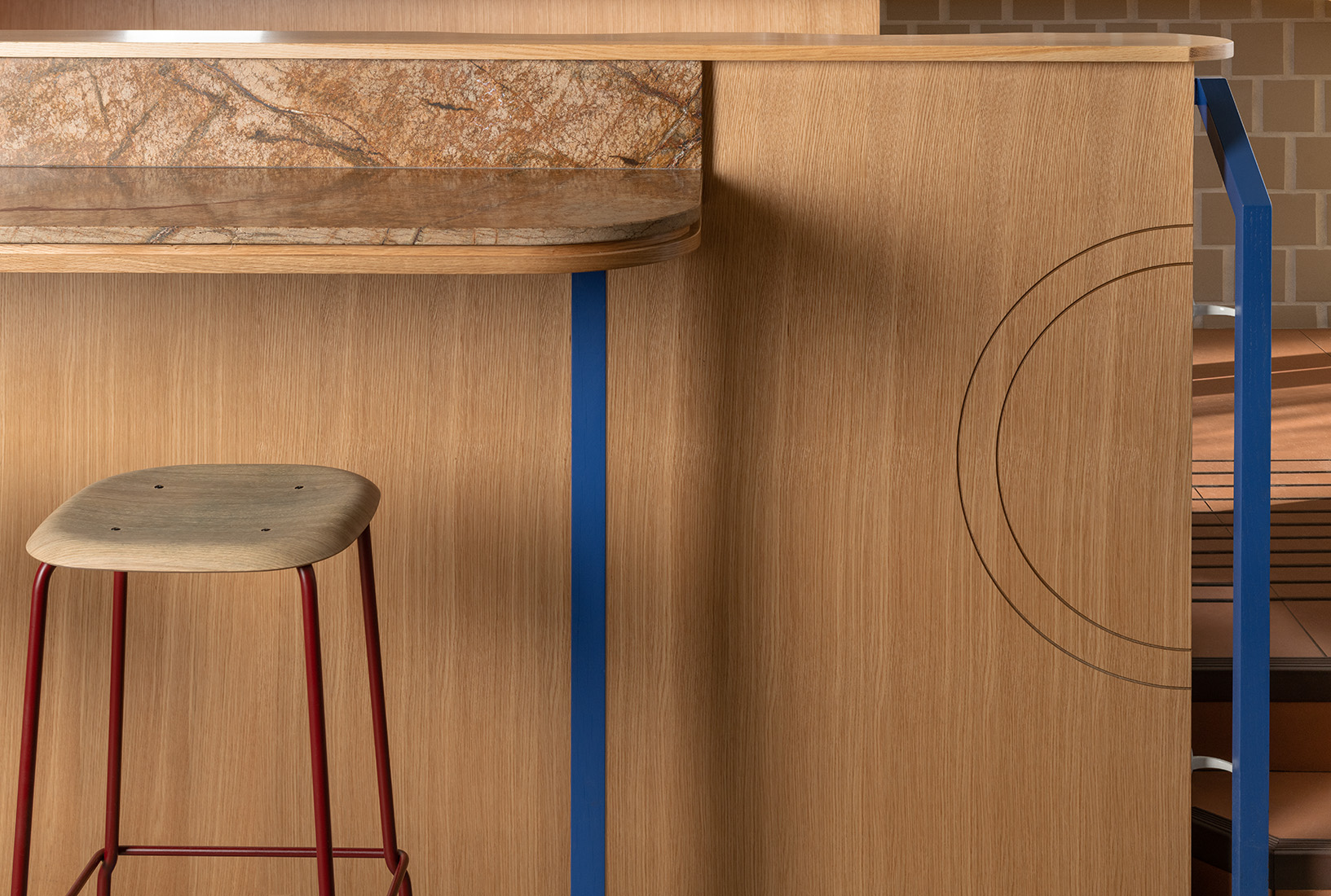
The basis of the palette of materials was inspired by ancient world Spain: ceramic cladding, stone, wood finishes Once these basic materials were in place, the distinctive concept was created: lighting, upholstery details that make a surrealist atmosphere, blue structures that skillfully creep into space

The project was realized in a new building, with over a third of the space on a ramp. The ramp was the most challenging problem, however, as it was believed that the result contributed to the success of the atmosphere. This situation meant that there was no choice but to interact directly with the guests at the entrance: an unexpected experience in the local gastronomic scene.

Gallery